Page MenuHomePhabricator

Add a direct unwatch link to entries on Special:Watchlist
Closed, ResolvedPublic

Assigned To
Authored By
bzimport
Sep 8 2004, 8:09 PM
Referenced Files
F24060498: image.png
Jul 24 2018, 5:53 PM
F5609405: pasted_file
Feb 11 2017, 9:55 PM
F5484419: pasted_file
Feb 4 2017, 11:38 PM
F5396933: pasted_file
Jan 29 2017, 1:25 AM
F5396924: pasted_file
Jan 29 2017, 1:25 AM
F5396959: pasted_file
Jan 29 2017, 1:25 AM
F4159802: pasted_file
Jun 13 2016, 5:55 AM
F4159813: pasted_file
Jun 13 2016, 5:55 AM
Tokens
"Like" token, awarded by RandomDSdevel."Like" token, awarded by Shizhao."Like" token, awarded by Liuxinyu970226."Dislike" token, awarded by Ricordisamoa."Like" token, awarded by Juandev."Like" token, awarded by Kozuch.

Description

Author: ui2t5v002

Description:
"and finally... a nice feature would be a possibility to remove a watched article from "my watchlist" (in the "my watchlist" view)"

This would be very convenient.


URL: http://meta.wikimedia.org/wiki/MediaWiki_1.3_comments_and_bug_reports#Moved_Pages_drop_off_Watchlist

Also proposed in Community-Wishlist-Survey-2016. Received 68 support votes, ranked #11 out of 265 proposals. View full proposal with discussion and votes here
Event Timeline

There are a very large number of changes, so older changes are hidden. Show Older Changes

Krinkle, do you still plan to work on this?

(In reply to Quim Gil from comment #41)

Krinkle, do you still plan to work on this?

Bump. If there's no response in a week or two, we should probably un-assign.

This comment was removed by Krinkle.
  • Bug 70924 has been marked as a duplicate of this bug. ***

Any chance for action on this? It seems to be relatively low on the difficulty scale.

Any chance for action on this? It seems to be relatively low on the difficulty scale.

It's pretty easy technically but people usually do not like even minor changes being made to pages they frequently use and also this probably needs design feedback as it adds more clutter to the already cluttered watchlist.

Could someone from Design comment on this task? How about a little 'x' icon next to each watchlist item? Without JS, the icon, when clicked, will remove the item from the watchlist and refresh the page (or something), but with JS, it replaces the watchlist item with some text, like "Item removed. Undo?" The 'x' might be more compact than a (unwatch) link, while still conveying the same meaning.

So, how we are doing with this bug? It was created more than 10 years ago and still not resolved! What is the purpose of WMF than? Why to spend time on the creation of superproctect and simillar stuff, which nonoone wants, if we are not able to hack something for community? How we are doing it easy for editors to contribute?

It'd be halarious if @Legoktm responded to that question with a gerrit patch

I'll attempt an overview/summary of why this is so complicated... UX/Design-wise, these are a few aspects to decide, that inter-relate:

  • What word/icon to show for the unwatch-link?
  • Should the unwatch-link always be visible, or only on demand ?
    • The 2 scripts shown in the screenshot below, are always visible, and therefore take up more space on the screen, and can be accidentally clicked more easily. If we use this solution, then an "undo" link might be good (albeit not required). Sn1per suggests this solution, above.
    • Or we could have an on-demand function. (e.g. Add a checkbox in the watchlist-options header area, labelled "Show unwatch links for each page". Or a link which makes the unwatch-links appear dynamically) ? Or, are there technical constraints, or social reasons, such that the links must always be visible? (The User:Js/watchlist.js script used to have on-demand functionality, but that aspect doesn't seem to be working currently)
  • What happens when we click?
    • The scripts shown below, "x" and "unwatch, the link changes colour when clicked, but nothing else occurs.
    • If I use navigationpopups to unwatch a link, it opens the bubble alert, with MediaWiki:Removedwatchtext e.g. http://i.imgur.com/Zc7qXo0.png - can we have that?
    • Other comments above, discuss jQuery and AJAX solutions, which IIUC would have dynamic effects such as sliding the row up and making it vanish. That sounds more complicated than necessary.
    • Sn1per suggests above "Without JS, the icon, when clicked, will remove the item from the watchlist and refresh the page (or something), but with JS, it replaces the watchlist item with some text, like "Item removed. Undo?"" -- The latter sounds good to me, for users with JS. I don't know what the optimal no-JS solution is.

Lastly, as @MZMcBride wrote above:

As far as I see it, the hard requirements here are that this feature:

  • be in MediaWiki core; and
  • not rely solely on JavaScript.

To which I would add: I believe the primary use-case is for removing individual links; not for doing bulk removals which are probably better done in the Special:EditWatchlist or Special:EditWatchlist/raw interfaces. For this feature, we just want something simple, that also doesn't further clutter up the watchlist interface.


The 2 existing scripts that I can get to function, look like this on Enwiki:

riRxlmZ.png (425×722 px, 110 KB)

Image showing:

  1. standard
  2. https://en.wikipedia.org/wiki/User:Alex_Smotrov/wlunwatch.js
  3. https://www.mediawiki.org/wiki/Snippets/Unwatch_from_watchlist

Please see similar task: T129790

Since I was specifically pinged, here's my answer: https://meta.wikimedia.org/w/index.php?title=Affiliate-selected_Board_seats/2016/Questions&oldid=15449001#Kunal_Mehta_7

It'd be halarious if @Legoktm responded to that question with a gerrit patch

I won't be, and here's what I said in my answer:

Speaking as a MediaWiki developer, I could personally fix T2424. I estimated it would take me about 2 hours to do so. But me fixing every bug that people bring up to me doesn't scale. So I would much rather spend 4 or 6 or 8 hours of my time working with and mentoring new contributors so they can fix the bug and then future ones themselves. So let me know if you (or anyone else) is interested in working on the bug and I'll be happy to assist. Legoktm (talk) 06:51, 17 March 2016 (UTC)

WIP Proof of concept patch will be up soon.

Change 293892 had a related patch set uploaded (by Sn1per):
[WIP] Unwatch link for pages in Special:Watchlist

https://gerrit.wikimedia.org/r/293892

@Sn1per Thanks for working on this. :-)
Would it be possible for you to add a screenshot and explanation here, for how your WIP patch works, so that those of us who aren't developers can more easily give feedback?
Also, let us know if there are any specific aspects you're still unsure about.

I can tell that it adds an × (×) character, and generally follows your description above. Good stuff!
But I'm not sure about the ramifications of the autoReload.js component... does that mean a new preference is being added to the Special:Preferences#mw-prefsection-watchlist section, or to the Special:Watchlist#mw-watchlist-options section? If so, that should probably be split out into a separate task, and a separate patch. (Context: there's an ongoing effort to reduce the number of (less-used) preferences in core.).

No problem. The existing Special:Watchlist javascript module (mediawiki.special.watchlist.js) was the reload-on-filter-change functionality and was loaded based on the preference option, so to avoid confusion I moved that to mediawiki.special.watchlist.autoReload.js. Preference options are unchanged.

The new mediawiki.special.watchlist.js handles the unwatch/watch link thingamajig.

This is what the 'x' button looks like on the watchlist (the patch is WIP for, among other reasons, the fact that the 'x' isn't placed properly yet, which is why it's absent on the first grouped entry)

pasted_file (540×783 px, 73 KB)

The page Testing is watched:

pasted_file (210×792 px, 21 KB)

With JS disabled, the 'x' button leads to the action=unwatch page (which is the same behavior as the watch/unwatch star w/o JS), which conveniently already has a link to return to the watchlist after unwatching.

pasted_file (187×830 px, 19 KB)

With JS enabled, the 'x' button sends an API request in the background to unwatch the page, then replaces all relevant entries with a "removed" message and an undo link. A notification should probably also be displayed. (not done yet)

pasted_file (113×279 px, 8 KB)

The undo link sends an API request to watch the page and restores the original watchlist entries.

I was thinking in the shower and I think using watch/unwatch stars would be a better solution. Unwatch stars are relevant on any recent changes list, so we don't need to put in a bunch of extra stuff to make the button only appear on watchlists. Also, having tons of "Unwatched. Undo?" links on a watchlist would not look very good; using stars preserves the content of each watchlist entry.

Would this would probably mean the unwatch star needs to be moved out of Vector? Or would a different (albeit space-consuming) solution like (unwatch) links be used in Monobook?

The stars are specific to vector, and their meaning would be particularly unclear if used here. Other skins do not use icons at all (a simple watch/unwatch tab) or use entirely different icons such as a pair of sunglasses. Please keep whatever you do skin-agnostic so as to avoid confusing users.

The line changing after and having the undo link there also seems like a bit much - is it really necessary to leave the page cluttered up with that until they refresh it? They've already clicked twice to confirm they wanted to do this, so it seems to me like the expectation would be for the items to just be gone at this point. Maybe use the corner popup as a confirmation that it worked instead, and put the undo link there, as this would also be consistent with behaviour when adding things to the watchlist in general, and also goes away on its own after a bit.

With javascript enabled, as long as there is an immediate way to undo, there shouldn't be a confirmation. We don't have to confirm when we watch/unwatch a page on its page, so it shouldn't behave differently in the watchlist itself.

I'm not sure which undo approach is my preference, but it must be convenient to get to.

As for removing a watchlist entry when unwatched, I can't see a necessity for that. There's no harm with keeping the entry there until the page is refreshed, I think. You can always have some kind of indicator that the particular entry is no longer watched (added text to that effect, or graying out, or...?).

@Stevietheman: ...or crossing out.

Undo could be a link inside of a blue tooltip (like the one when you start watching some page)

The line changing after and having the undo link there also seems like a bit much - is it really necessary to leave the page cluttered up with that until they refresh it? They've already clicked twice to confirm they wanted to do this, so it seems to me like the expectation would be for the items to just be gone at this point.

I thought we were discussing a one-click process/workflow for removal, not two clicks.

Maybe use the corner popup as a confirmation that it worked instead, and put the undo link there, as this would also be consistent with behaviour when adding things to the watchlist in general, and also goes away on its own after a bit.

There's no log of watchlist entry additions or removals. My concern is that if a user accidentally removes an entry, he or she will only have a small amount of time to undo the action before the notice disappears. Maybe this concern is overblown, but I could see myself accidentally hitting a remove link and then scrambling.

Note that this is appearing as a proposal in the 2016 Community Wishlist Survey here.

As for removing a watchlist entry when unwatched, I can't see a necessity for that. There's no harm with keeping the entry there until the page is refreshed, I think. You can always have some kind of indicator that the particular entry is no longer watched (added text to that effect, or graying out, or...?).

How about graying out/striking out the entry, but changing the 'x' into a '+' (instead of showing the undo links in the text)? The meaning of the '+' might not be easily recognized, however.

The patch is now in a working state. Please comment on the design.

Unwatching a page (in the current design) strikes it out and grays it out. If the page is a talk page, the associated page is also struck out (and vice versa for a non-talk page). The '×' turns into a '+' which can be used to re-watch the page (effectively undoing the unwatch). There are tooltips on the '×' and '+' links describing their purpose.

Non-grouped changes list:

pasted_file (633×1 px, 125 KB)
pasted_file (201×1 px, 64 KB)

Grouped changes list:

pasted_file (225×1 px, 68 KB)

Thank you @Sn1per for your excellent work. This design works for me overall. I just have a couple thoughts:

  1. Users are accustomed to seeing a bubble alert when they watch or unwatch. It may be best to extend their use here too. Maybe you are already doing this, but I can't tell from the graphics.
  2. Perhaps the '×' and '+' could be skinnable, so Vector could set smaller versions of a full star and empty star in their place, for consistency for Vector users.
Users are accustomed to seeing a bubble alert when they watch or unwatch.  It may be best to extend their use here too.  Maybe you are already doing this, but I can't tell from the graphics.

There are notifications using the same wording and messages as the notifications that pop up when you use the (un)watch star/tab on a normal page; they just aren't visible in those screenshots.

Perhaps the '×' and '+' could be skinnable, so Vector could set smaller versions of a full star and empty star in their place, for consistency for Vector users.

I can add some CSS classes representing the state of the page (unwatched, loading, watched) to the links so that they can be skinnable via CSS. [[https://doc.wikimedia.org/mediawiki-core/master/js/#!/api/mw.page.watch.ajax-method-updateWatchLink|updateWatchLink]] seems useful and would be reuse of existing code, but would require more modification since its logic is specific to the watch link in the content actions portlet. I did try adding some CSS rules in my browser dev console to give an idea of what a Vector skinned unwatch link would look like:

pasted_file (360×928 px, 84 KB)

Is it appropriate to use the #ca-(un)watch element ID here, or should I use a new class name? Re-using #ca-(un)watch would make the required changes to the Vector watch star CSS simpler, but might be considered abuse of the element ID name.

Is it appropriate to use the #ca-(un)watch element ID here, or should I use a new class name? Re-using #ca-(un)watch would make the required changes to the Vector watch star CSS simpler, but might be considered abuse of the element ID name.

It wouldn't really work, there is supposed to be only 1 element on a page with a given ID.

The vector skinning image looks pretty good, although I might have expected the stars to be a bit smaller to fit into the lines better. I can't really speak well to the class/ID matters - a bit over my head, although matmarex's point looks accurate. Reuse sounds good, but if you have to contort code for such, maybe it's better to strike out with some new classes/IDs specific for this purpose.

I've updated the patch to work with log entries. Since EnhancedChangesList groups log entries by performer, grouped log entries do not have an (un)watch link, although sub-entries of log entries will have the same style changes if the page that they relate to is unwatched or watched.

pasted_file (838×940 px, 219 KB)

@nzr Can we get some design feedback on this? There are screenshots above.

The latest patch is at https://gerrit.wikimedia.org/r/#/c/293892/

@Pginer-WMF Maybe you can take a look at this during the hackathon? :)

@Pginer-WMF Maybe you can take a look at this during the hackathon? :)

I may lack a bit of context about this, but here are some initial thoughts:

  • Having a way to unwatch pages from the Watchlist page makes sense if that is a common place where people notice they are getting updates from a page that it is no longer relevant for them.
  • An action prominence should be proportional to their importance and frequence of use. One concern with the proposed solution is that the action is presented as one of the first information items to process where it may not be expected to be one of the common actions to be used regularly.
  • Another concern based on the screenshots is that placing a remove action next to the expand control can lead to accidental clicks.
  • Conceptually, the unwatch action is applied to the page, not the specific edit that the line of text represents. Providing the action closer to the element it affects may add more clarity (e.g., a user trying to remove a specific entry, and getting unsubscribed from further edits on the page).
  • The main goal to make the process more fluent should be more about having a clear path to the result (e.g., avoiding the process of finding the page again in a long list of watched pages) than focusing only on the number of clicks.

Based on the above, some potential additional directions to explore:

  • Tooltips on hover can show more information about the page with more advanced actions such as unwatch. The "page preview" beta feature and the "navigation popups" follow a similar approach. That would keep actions in context without adding more information for those scanning the list to process.
  • On the "Manage Watchlist" page, surfacing recent visited pages (or pages with recent activity) would help to make the process of finding the page you want to remove much easier. This would still require to change context to the "manage" view but could avoid the bigger waste of time which seems to be finding the page again.
  • A general menu for actions available at the end of the information line (e.g., "...") can provide access on click/hover with more actions. Unwatching can be one of them.
  • Providing a way to select items in the list would allow for actions on the selected elements to be applied. This is a similar idea to the one above, but actions can be accessed from a more persistent place such as a toolbar.

I hope some of the ideas can be helpful.

Change 293892 merged by jenkins-bot:
[mediawiki/core@master] Unwatch link for pages in Special:Watchlist

https://gerrit.wikimedia.org/r/293892

matmarex edited projects, added User-notice; removed Patch-For-Review.

I think we should mention this new feature in next Tech News - note that it's off by default for now (you have to turn it on in preferences). I wish we could turn it on for everyone, but let's see how well it's received first :)

Thanks for the comments Pau.

  • An action prominence should be proportional to their importance and frequence of use. One concern with the proposed solution is that the action is presented as one of the first information items to process where it may not be expected to be one of the common actions to be used regularly.

On the other hand, it's tiny. It's at the beginning of the line so that its position is consistent on different lines -- this is a shortcoming of our current design for the watchlist, which uses lists for the items instead of tables or something where we could align the different things in a single line.

  • Another concern based on the screenshots is that placing a remove action next to the expand control can lead to accidental clicks.

I think this is sufficiently mitigated by being able to undo the mistake with one more click.

  • Conceptually, the unwatch action is applied to the page, not the specific edit that the line of text represents. Providing the action closer to the element it affects may add more clarity (e.g., a user trying to remove a specific entry, and getting unsubscribed from further edits on the page).

I think this is also sufficiently clear with the popup message shown afterwards (not shown on the screenshots, but it's the same one as when watching pages normally), and with any additional visible entries for the same page being grayed out.

  • Tooltips on hover can show more information about the page with more advanced actions such as unwatch. The "page preview" beta feature and the "navigation popups" follow a similar approach. That would keep actions in context without adding more information for those scanning the list to process.
  • A general menu for actions available at the end of the information line (e.g., "...") can provide access on click/hover with more actions. Unwatching can be one of them.

I kind of like this idea, but:

  • Right now we only have one action to show in such a popup -- what is the point then?
  • Different kind of hover popups tend to conflict with each other :/

I think we should mention this new feature in next Tech News

This will go into production later this week? Or next week?

I think we should mention this new feature in next Tech News

This will go into production later this week? Or next week?

This week.

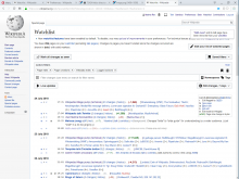
New UI does not contain it. BTW could the cross in the new UI be next to the page title (to be easily findable and understandable)?

@Dvorapa I see the extra buttons with new watchlist filters enabled, and they work correctly.

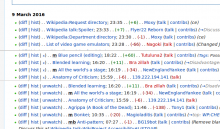
image.png (1×1 px, 275 KB)

Make sure you have "Add direct unwatch/watch markers…" enabled in your preferences.

If they don't appear with some specific combination of options, please file a separate task with the details.